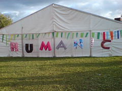
Including the usual touches of humour, like the blue plaques on the busker stages.
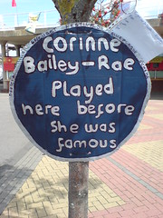
Then again there is some site decoration that isn't quite where it should be. Is that a kiosk it's stuck to? No, surely not? If we can't even get Oli to...
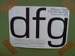
Still all is forgiven when you see how they've used the review at the bottom (especially the treatment of the reviewers name). Pure class. High res version here.
4 comments:
flickr wont let me into the high res version :( what does it say? awwww, please?
really loved the vibing this year. very very nice people. thank you.
(Imaine the letters in bold are also in a much larger type-face)
Tony Cummings Crossrhythms Greenbelt review 2005
Giles (service with a smile?)
I should've said that, fairly obviously, that's just the reveiwer's name - they'd commited magic throughout, but I'm too lazy to go through it all (a copy of the poster has been applied to L's door by willy-nilly, which he's hoping she'll think is a nice surprise...)
love again
Giles
Just for you C I've added a larger version of the bottom of the poster.
You'll see the reviewers name has been adapted in a similar but different version to the one Giles quotes.
I'm told there was a third version, forming a four letter word. I understand it was decided against. And people say they have no sense of boundaries ;-)
Post a Comment